


Good morning - We’ve seen plenty of Silver-related content by now, but I wanted to share 3 specific charts that really caught my eye.
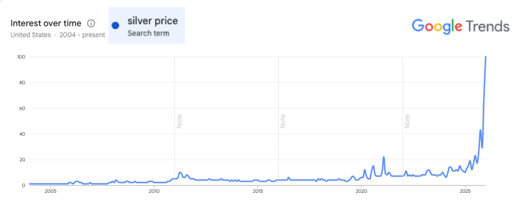
Silver’s Price on Google Trends
We know all about Silver’s spike on massive volume. But how many people outside of the trading world actually have taken notice of what happened yesterday?
A lot.
How do we know this? Because the term “silver price” has spiked even more than the commodity itself.
Look at the chart compared to 2021—from this perspective, you can barely even detect when the Silver Squeeze six years ago took place. That doesn’t necessarily mean a new wave of people is suddenly rushing in to buy silver, but heightened interest in something dominating the mainstream news certainly is prompting far more people to take notice… and that is the first step before deciding to buy.
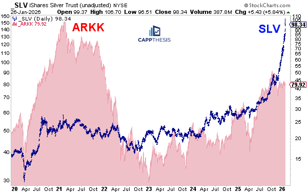
Silver’s vs. ARKK – An unlikely comparison
Here’s a chart that I’m guessing isn’t being talked about—SLV vs. ARKK. Why does this matter? Back in early 2021, SLV briefly got caught up in the euphoric, ultimately short-lived chase of the newly dubbed meme trade. When that bubble burst, it dragged down much of the speculative complex, including ARKK (as well as XBI and others).
The SPX continued to grind higher for another 11 months, but that episode marked one of the first signs of overheating in a specific corner of the market.
ARKK has been fighting back in recent months, but it’s still nowhere close to where it once stood—either in price or sentiment. In other words, this move in silver can’t be attributed to anything else besides its own momentum. That may not have been the original catalyst for the rally, but it’s now the reason why moves like yesterday occur.
SLV Silver – The phases of each upswing
So what can we expect from here? We’ve seen strong multi-week runs before—just within the last nine months. Each time, a steady advance (blue lines) became overheated (green lines), eventually leading to a pullback. Those pullbacks are barely noticeable on a log chart, but each one still generated some concern, especially during October–November.
This time, the same sequence has played out—but at a much faster pace. The “blue” phase lasted longer, then gave way to an even steeper green uptrend, and the surge over the last few days has pushed the move close to vertical (black line). Anything more aggressive, and the line might start turning left (that’s a joke).
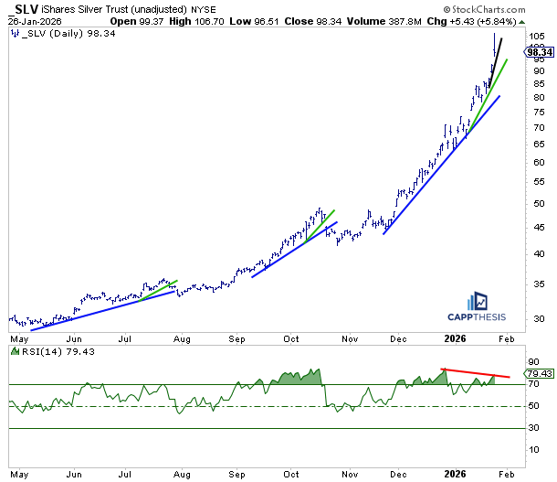
Here’s how the next bout of corrective activity could unfold…
CappNotes offers a small window into the work we do at CappThesis - a technical analysis newsletter company focused on classical chart patterns, trend, and risk management. Explore the full range of CappThesis services here:
Parabolas
Play Carefully
Thank you. Yes, agreed.