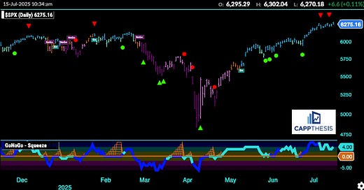
With the CPI data, big bank earnings and continued geopolitical news hitting the tape this morning, the SPX has plenty to key off of today.
As is crystal clear, the index has weathered every and all potential negative catalysts since the middle of April. At some point news (good or bad) will be a reason to take profits. So far, we still only have had two 1% declines since 4/21. A bigger pullback continues to be “due.” Everyone knows it. For now, though, while extreme buying has taken a breather, it has yet to be replaced with all-out selling.
GoNoGo Trend – Daily
The daily chart we use to display the GoNoGo Trend remains bullish — as it has been for two straight months, ever since it flipped to bullish in mid-May.
That said, there are other indicators within the system that I want to highlight today, as they offer a clearer view of potential short-term shifts. At times, they can provide early signals before price confirms the move. Let’s take a look at that chart next.
GoNoGo Trend – Countertrend Moves
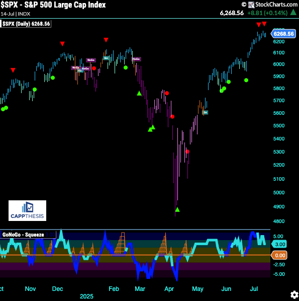
Here is the same chart, but as we can see, a few new arrows and dots now appear, as well. Today, we’re focusing on the red arrows, which just showed up over the last several trading days.
At a glance, this is concerning — because the last three instances of red arrows appeared near market tops: just before the S&P 500 endured pullbacks in October, early December, and late January. In two of those cases, we saw mild pullbacks, but the third led to a deeper correction.
It’s important to understand what these red arrows represent:
The red arrows are “Go Countertrend Correction” icons: they signal a short-term pullback during a bullish (Go) trend where momentum has temporarily weakened.
The red arrow appears right as the GoNoGo Oscillator (on the bottom panel) dips back toward the zero line from above, marking a retracement or consolidation in price. It flags a possible short-lived weakening—not a full trend reversal
The red arrow isn’t warning of a trend change—it’s a low-risk signal that the upward move just took a breather.
👉 If the trend stays intact, it’s usually a bullish continuation indicator.
It’s crucial to highlight why the red arrows, in isolation, are not necessarily sell signals. Here’s how they’ve appeared on the chart — from the late fall 2023 low through the summer of 2024.
As we know, the market enjoyed a strong and consistent rally during that period. But along the way, there were short-term pauses, each of which pulled the oscillator mentioned above back from extreme levels. This allowed the S&P 500 to catch its breath, and in each case, the rally resumed soon after.
So with the S&P now stalling near its highs after another extremely strong run, it’s no surprise that these signals of digestion have popped up again.
Whether this leads to a more meaningful pullback will depend on whether bearish patterns begin to form on a short-term basis — and so far, none have.
Next, here are EIGHT Semiconductor charts that paint a complete technical picture both from a short-term and long-term perspective…


