


Good morning. Here’s an excerpt from today’s Opening Look note.
Why This Setup Deserves Attention
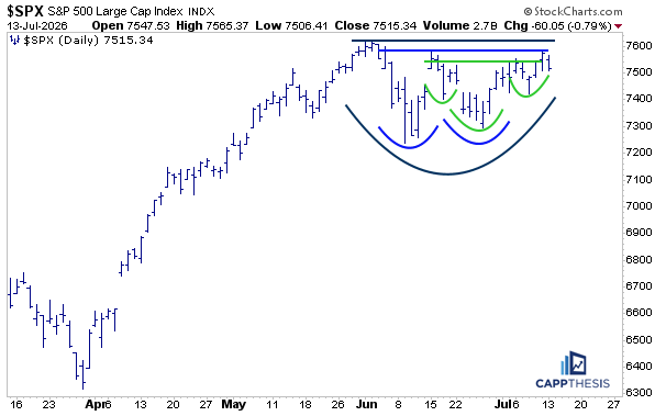
Ever since the S&P 500 pulled back in early June, we’ve been tracking several potential bullish continuation patterns. At multiple points during that pullback, buyers had opportunities to regain control and confirm one of the bullish formations we’ve been discussing over the past six weeks.
Today, three potential bullish patterns remain in play, although none has been fully confirmed. We continue to believe they have a favorable chance of resolving to the upside.
That said, it’s equally important to consider the alternative.
Rather than focusing solely on what could go right, it’s worth asking what the market might look like if these breakout attempts ultimately fail.
A Familiar Look From Late 2025
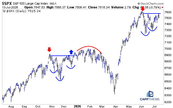
Looking more closely at the current setup, there are notable similarities to the pattern that developed in late October 2025, shown in the chart above.
At that time, the market rallied sharply, driven largely by large-cap Technology, as several mega-cap companies surged following earnings reports.
The rally, however, was short-lived.
Selling pressure quickly emerged, leading to a pullback that lasted through mid-November. Similar to today’s environment, buyers then stepped back in aggressively, fueling a sharp rebound that carried the S&P 500 back to its prior highs.
From there, the index made multiple breakout attempts throughout December, January, and February. Each attempt failed to generate enough buying pressure to sustain new highs.
Although the S&P 500 managed to hold near resistance for several weeks, momentum gradually deteriorated before the market finally rolled over, setting the stage for the decline that ultimately bottomed in late March.
There are no signs that this same outcome is unfolding today.
However, the current rebound is beginning to resemble what developed during mid-December 2025, making it an important historical comparison to keep in mind should today’s breakout attempts lose momentum.
SPX vs. Technology Leadership
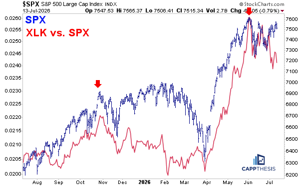
The primary reason the market rolled over late last year was that the strong outperformance from large-cap Technology simply came to an end, as shown by the XLK/SPX relative strength line peaking alongside the S&P 500.
That development proved to be more significant than it initially appeared.
Technology’s relative weakness persisted through the early part of 2026. Eventually, the S&P 500 followed suit, and the broader market correction unfolded.
Today’s environment shares some similarities.
Large-cap Technology experienced an even more pronounced period of parabolic outperformance before peaking in late May and early June. Since then, the S&P 500 has traded sideways, remaining remarkably close to its highs despite significant rotation beneath the surface.
Meanwhile, the XLK/SPX relative ratio line has begun producing a series of lower highs and lower lows over the past several weeks.
The key question now is straightforward:
What catalyst, if any, could cause the S&P 500 to finally follow Technology lower, similar to what occurred from February through March earlier this year?
So far, that hasn’t happened.
But it remains one of the most important relationships to monitor.
Breadth Has Been the Difference
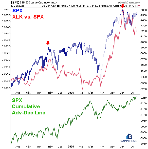
The third chart helps explain why this market has remained so resilient.
Strong market breadth—healthy participation across sectors—was a major reason the S&P 500 was able to recover and remain near its highs from November 2025 through early February 2026.
When the advance-decline line peaked, however, the character of the market changed dramatically.
Even though the XLK/SPX relative strength line began improving in early February, it wasn’t enough to offset the steady stream of negative breadth days that developed over the following four weeks.
In other words, Technology leadership alone couldn’t overcome broad market deterioration.
Today, the picture looks very different.
The advance-decline line bottomed—or, more accurately, made a higher low—in mid-May and has been trending higher ever since.
That improvement in participation has been a major reason the S&P 500 has remained so close to its highs despite Technology’s recent period of relative weakness.
In many ways, breadth has become the market’s shock absorber, allowing rotation beneath the surface without causing widespread technical damage.
The Bottom Line
At this point, healthy breadth remains the primary factor keeping the market resilient and all three bullish patterns alive.
As long as broad participation continues to improve, the odds still favor an eventual breakout to new all-time highs.
The key question is whether this time can be different.
Can Technology stabilize while market breadth remains strong?
If so, the market may continue absorbing the recent rotation and eventually resume its longer-term uptrend.
If not—and the rest of the market begins to experience the same degree of profit-taking that Technology has already seen—we could eventually find ourselves in another corrective environment, similar to the one that developed from February through March earlier this year.
For now, breadth remains the key bullish offset to Technology’s recent weakness. Whether that relationship continues may ultimately determine which direction the S&P 500 breaks next.
CappNotes offers a small window into the work we do at CappThesis - a technical analysis newsletter company focused on classical chart patterns, trend, and risk management. Explore the full range of CappThesis services here:
Bullish patterns don't fail because of the pattern itself. They fail when the underlying macro regime changes.
Price confirms. Liquidity leads.