


TGIF - Here’s an excerpt from the market section of today’s Opening Look.
Also - I had the honor and pleasure of being Seth Golden’s (Finom Group) podcast guest yesterday. It was a fantastic conversation covering market strategies, career moments, and some humor along the way reflecting on Wall Street.
Check it out here. Link to podcast.
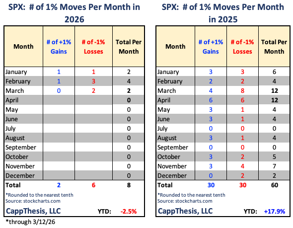
SPX: 1% Moves
Here’s an updated table showing all the 1% moves so far in 2026. There have now been six 1% losses and just two 1% gains, with the SPX down about 2.5% for the year…
A few takeaways from this:
First, we’ve had at least one 1% decline in each of the last five weeks, and during that timeframe there’s been only one 1% gain. That was at the very beginning of February.
It’s been lopsided, and one of the key components of an uptrend, as we often discuss, is having a low amount 1% absolute moves overall but also more 1% gains than losses. Clearly that has not been the case over the last five to six weeks.
That has resulted in the loss of momentum and the general downtrending price action we’ve seen over that timeframe. Anytime that scenario develops, we have to be concerned that a bigger downturn could be afoot.
At this point, though, it is still nowhere near the number of 1% moves we saw last year at this time. Even though this index’s rollover at this time of year has been compared to 2025, through March of last year there were a whopping 22 total 1% moves, with 13 of them to the downside.
We know that was an extraordinarily volatile period, which has yet to be replicated. However, beneath the surface there have already been much larger drawdowns in other areas, just not in the S&P 500 itself. We’ll look at a few of those ETFs below.
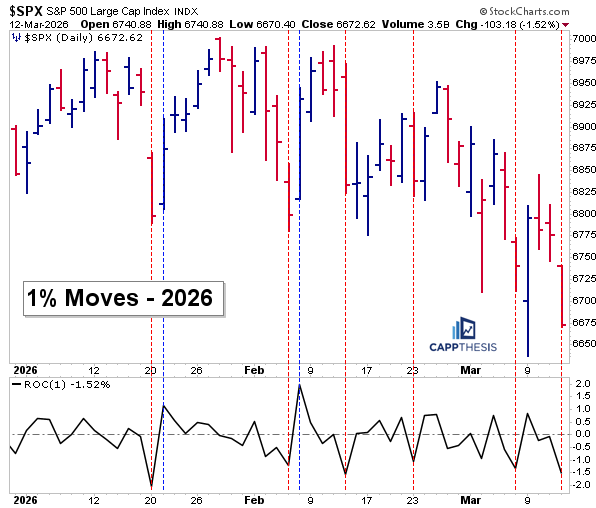
SPX – 1% moves in 2026
Here are all the 1% moves so far in 2026. As is clear, the first two 1% declines were immediately followed by strong moves of at least 1%, both in January and again in February. The move on February 6th was the last 1% gain we’ve seen.
A few weeks after that came another 1% decline. We didn’t get a 1% gain afterward, but we did see four gains in the next five days. That helped stop the bleeding, but it ultimately resulted in a lower high… with more lower highs resulting since then.
A bearish GoNoGo Trend and now a breakdown through a bearish pattern tell us exactly what type of trading environment we’ve been in. One of the reasons for this is that the foundation has now been diminished in a very noticeable way.
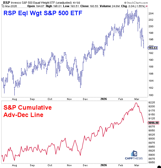
Bad Breadth
We showed the S&P 500’s adv-dec line earlier in the week, pointing out that it had obviously come off its highs, though we’ve seen short pullbacks in it before. With the decline continuing throughout this week — and with one of the worst breadth readings of the year yesterday — it’s clear the line has now taken a material hit.
We’re pairing this with RSP (S&P; 500 Equal Weight ETF) this time, since the weakness in breadth is directly reflected there. Unlike the cap-weighted index, it doesn’t have the influence of a few large names pulling in one direction or the other. Not surprisingly, these charts look very similar.
RSP, as we discussed yesterday, is breaking below a key bearish formation and has also seen its GoNoGo indicator turn bearish. It’s approaching oversold territory, so now it’s just a matter of seeing breadth finally stabilize after a very trying two and a half weeks.
When bad breadth suddenly turns around
My good friend and very successful trader and analyst, Seth Golden of Phenom Group, pointed this out yesterday morning.
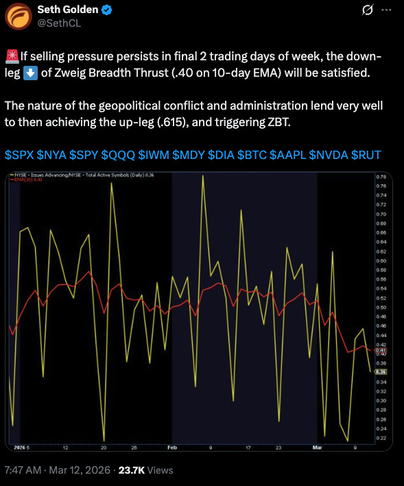
This indicator is usually discussed in terms of the upside volume and strong breadth thrusts, but it’s really a combination of first seeing decidedly negative breadth and then having that flip decisively higher in a short amount of time. That type of scenario is what slingshots the market higher — you see shorts covering and investors chasing, which is why the indicator has such a strong track record.
It uses a 10-day moving average of a ratio — advancing NYSE stocks divided by total stocks (advancing + declining). A signal fires when that ratio moves from below 0.40 (very weak, most stocks falling) to above 0.615 (very strong, most stocks rising) within a 10-day window.
We would likely need meaningful news from overseas, along with a broad reversal in many of the areas that have been underperforming — just about everything except energy. We actually saw a brief glimpse of that on Monday.
It’s something we have to stay aware of because, as we know, volatility — especially when it’s headline-driven like this — cuts both ways, and often violently.
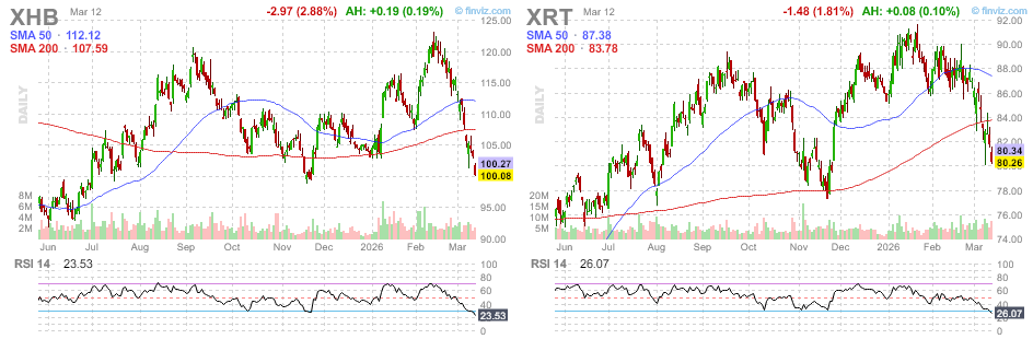
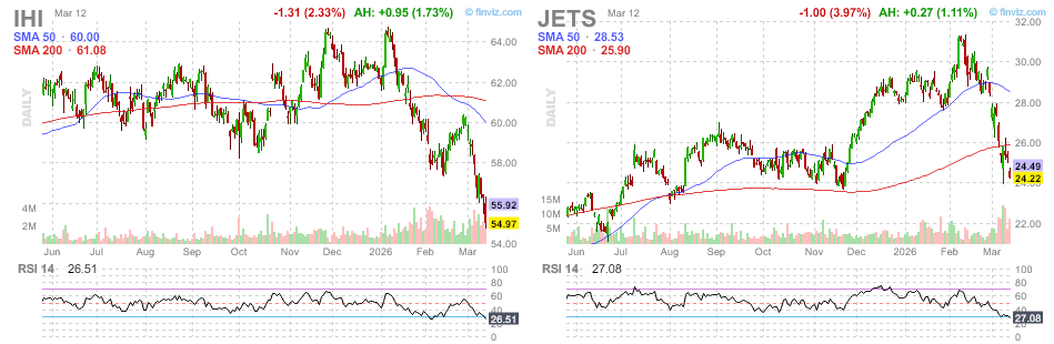
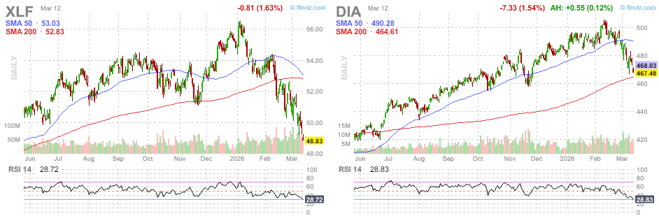
The Most Oversold Key ETFs
If and when the next bounce phase arrives, the question becomes: which areas would snap back the most? A simple way to take an educated guess is by looking at the ETFs that have been hit the hardest over the last few weeks.
These are key ETFs trading at least 200,000 shares per day and currently rank among the most oversold. Given the recent breakdowns, that’s not surprising. Each of these could benefit from a market-wide bid and potentially move at a faster clip than the major indices.
One interesting takeaway is that among the six most oversold ETFs, one of them is DIA (Dow Jones Industrial Average ETF). It currently has an RSI of 28 and is down about 8% from its high, yet it’s also the only ETF on this list still above its 200-day moving average while being oversold.
A few reasons for this:
1-It didn’t decline as much as the others in percent terms. Some of them began falling earlier, especially XLF.
2-The preceding advance was more consistent and didn’t feature the parabolic activity near the end that some of the others showed.
The other five ETFs are more volatile and could ultimately move higher at a faster pace when a bounce comes.
CappNotes offers a small window into the work we do at CappThesis - a technical analysis newsletter company focused on classical chart patterns, trend, and risk management. Explore the full range of CappThesis services here: