


Happy St. Patrick’s Day.
We’re not talking about college basketball today (at least not yet)… but March has been just as wild for the financial markets as the games are sure to be this week.
Below are where things stand heading into tomorrow’s FOMC meeting.
But, first, check out this interview I did yesterday with Trevor Hall of Mining Stock Daily.
The SPX’s Bearish Pattern
Despite yesterday’s strong rally, the SPX again finished below its recent bearish breakdown zone. The downside target remains near 6,575. This isn’t too far away but simply hitting a bearish pattern objective would be noteworthy. And that’s simply because we haven’t see ANY bearish formations play out for the index in nearly a year.
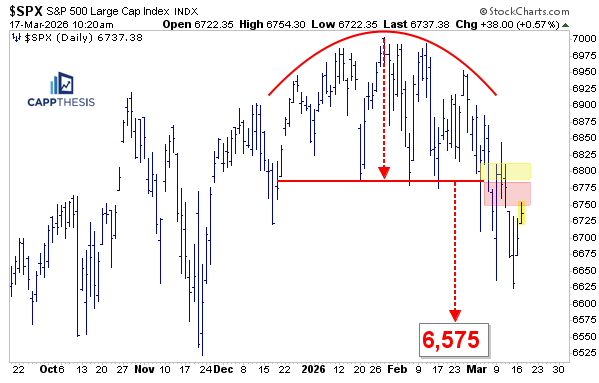
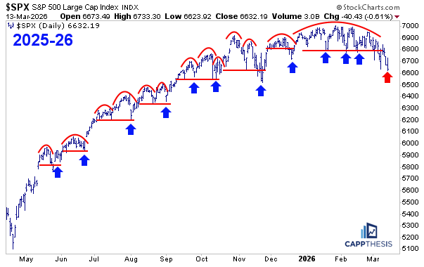
Bearish Patterns – 2025-26
Here’s an updated look at how the current bearish pattern appears next to the failed topping setups we’ve seen since last May.
So far, it looks most similar to November, when there was a noticeable break right before buyers came back once again, creating a very clear bear trap. We need to see that type of demand hold for longer than a few hours this time.
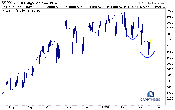
A Bullish blueprint
As we know, volatility cuts both ways, so at any point we could see a decisive face-ripping rally - more severe than yesterday’s gain. If that were to occur relatively soon, then we can begin to see if any resulting upside follow-through can turn the most recent downside action into a key low.
We’ve seen it before: a finding support is the first step toward a reversal. The ensuing steps would then be upside follow-through and, eventually, a higher low. That process could help form a bullish pattern. We would likely see that first on a short-term basis, but it’s also clear how going through that process could turn the entire last few weeks into one large bullish structure.
In general, the greater the volatility, the bigger the ensuing bullish formation. That can sometimes develop quite quickly—like we saw over the last number of months from last April through last October. Other times it takes much longer to play out. We’ll be tracking it the whole way, regardless of how long the duration lasts.
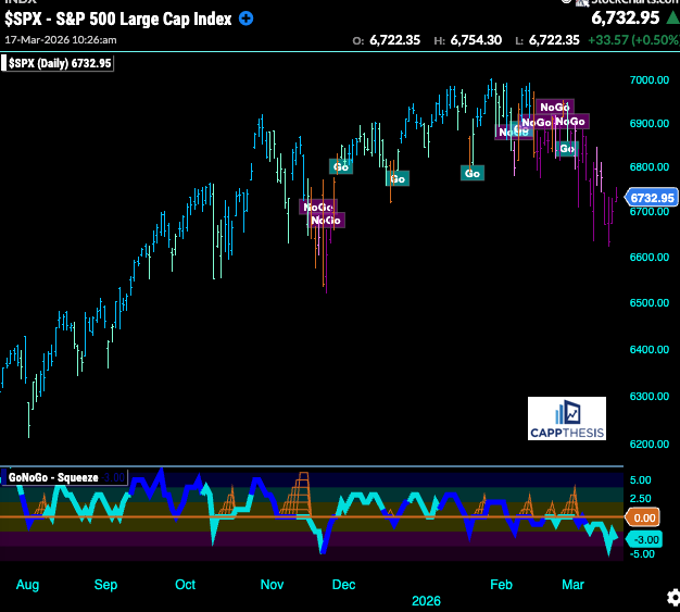
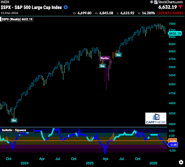
GoNoGo – Remains in NoGo Mode
The GoNoGo indicator has been one of the best trend barometers over the last weeks, flipping from decidedly bullish to flashing some whipsaw-like activity to then going to bearish in early February. It remains in NoGo mode now.
GoNoGo Weekly – Remains in Go Mode
The weekly GoNoGo Trend remains in Go mode, but we continue to see aqua bars, meaning the trend has weakened compared to what we saw through late last year (blue bars).
Thus, the recent negative momentum is not yet fully reflected from a longer-term perspective like this, but if it continues, it’s inevitable that we’ll eventually see a neutral or amber bar appear. And that is often the next step in shifting the trend from bullish to bearish. We’ve seen it before after long runs, and, thus, a lot will be riding on how the market responds in the latter half of this week.
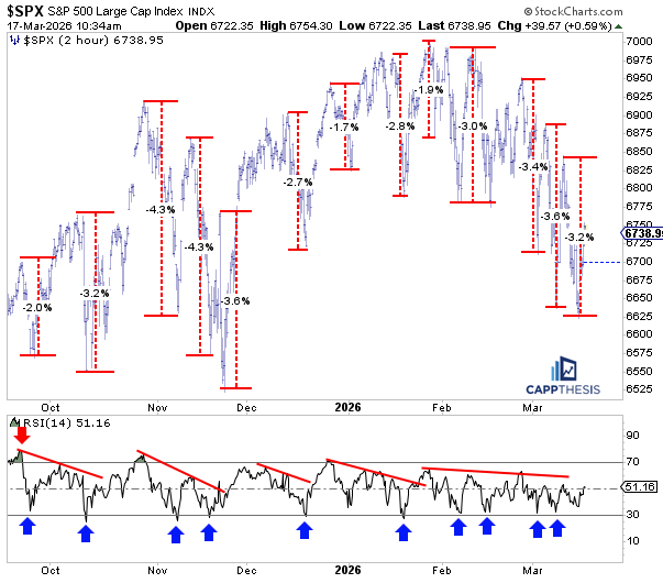
SPX – Short-term drawdowns
The index’s most recent pullback got to about 3.2% from this past Monday’s intraday high to Friday’s low. As is clear, it’s pretty much in line with the intraday drawdowns we’ve seen going back to last October. Whether the market was moving higher overall or not, the pullbacks after a bounce have generally been around the same size and duration.
We talked a lot about how the bounces haven’t produced an overbought reading on the two-hour chart going back to December. Even though we’ve gotten very close to oversold levels, which have helped produce bounces, we have yet to see a true extreme oversold reading since the middle of January. Hence the consistent yet slow unwind we’ve now seen over the last few weeks.
SPX – % Stocks above 20-DMAs
Needless to say, with the SPX pulling back and the subpar breadth readings we’ve seen now for over two weeks, many of the index’s components have dropped below their respective 20-day moving averages. Below is a chart which shows this phenomenon going back to June 2022, since that’s when StockCharts.com started to track it.
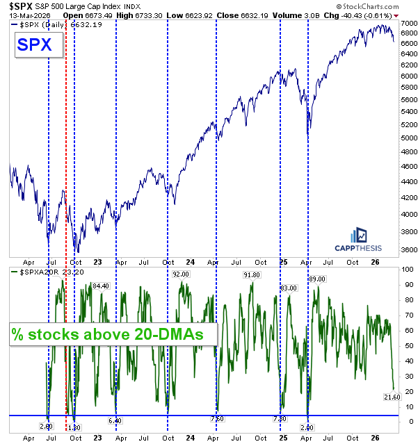
As is clear based on this chart, oversold readings have taken place when the number has dropped to 8% or below over the last few years. Thus, readings below that level have typically coincided with either a pause in the market decline and/or a major trading low. From that perspective, we’re not quite there yet.
However, a quick FinViz screen shows that 85 stocks are sitting within 0–5% above their 20-day moving averages. In other words, 85 of the roughly 108 stocks still above the line are very close to slipping back under it. If all 85 did, in fact, drop below their 20-DMAs, the percentage would fall to roughly 4.5%.
That’s not a guarantee, but it does show how quickly this indicator could change. Two — or even one — more sizable down days could push it much lower, or at least closer to the extreme readings that have marked tradable lows over the last few years h/t JI
1% Moves
The SPX had logged four 1% declines before finally notching yesterday’s 1% gain, and this one came just two trading days after last Thursday’s big decline. There’s a lot more work to do, but this was a necessary first step.
Here’s a chart of all of the 1% moves so far in 2026. After yesterday, there are now three 1% gains versus six 1% declines. That’s not a lot over roughly 10 weeks, but three have occurred within the last seven trading sessions. If that pace were to continue, it could become troublesome.

Again, this is a very small sample size, but we recall how things transpired in the early months of 2025. From February through April, there were frequent ±1% daily moves – in fact, there were MORE 1%-days vs. NON-1%-days during the worst of the two-month crash.
The greater the frequency of large daily moves, both up and down, the greater the likelihood of a more violent trading environment. If that were to develop, it would make the bullish chart structures we often identify more difficult to trust. When breakouts occur in that type of environment, they can quickly fail, which is something we’ve seen repeatedly over the last several weeks, particularly from late January through recently.
CappNotes offers a small window into the work we do at CappThesis - a technical analysis newsletter company focused on classical chart patterns, trend, and risk management. Explore the full range of CappThesis services here: