


To conclude the month and quarter, I wanted to share today’s full-length Opening Look note.
Also, here’s my CNBC appearance from yesterday’s Morning Call show.
Key Points
The SPX avoided another big down day yesterday, but the early 1% gain was quickly erased. As a result, the index now has a three-day losing streak, marking the second 3-day slide in the last two weeks. We’re also tracking the next weekly MACD buy signal. See more below.
Last 5 Trading Days
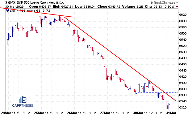
Daily Price Action
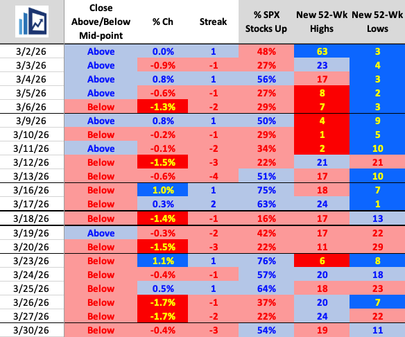
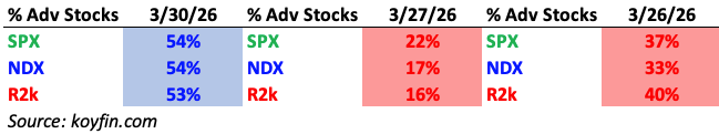
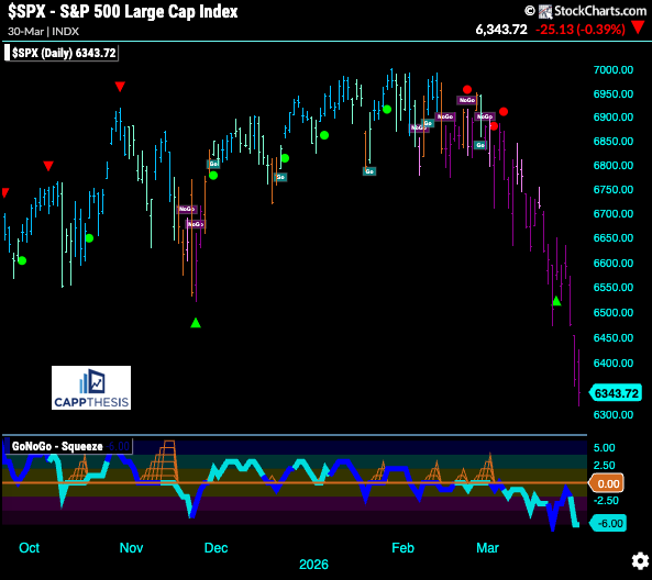
The index has now closed below its intraday midpoint in 12 of the last 13 trading sessions and 14 of the last 16. However, breadth was once again positive, marking the fourth time in the last six days we’ve seen positive internals for the index.
Sectors – Financials bounce back; Tech lags
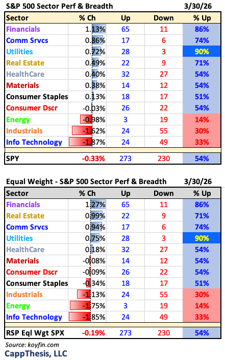
Breadth – Marginally positive
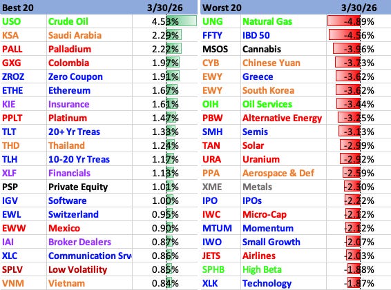
Best & Worst 20 – Bonds, Financials lead
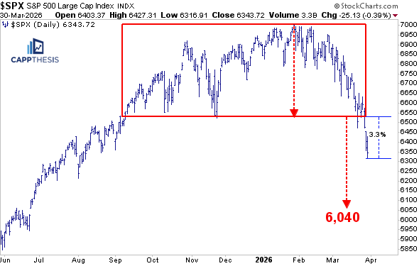
The Big Bearish Patterns
With Monday’s negative reversal, the SPX dropped further below the 6,520-mark, and, thus, the trading box pattern downside target of 6,040 remains in play. If we finally do get a legitimate snapback soon, the index would have to gain approximately 3.3% from yesterday’s low to reclaim that breakdown zone.
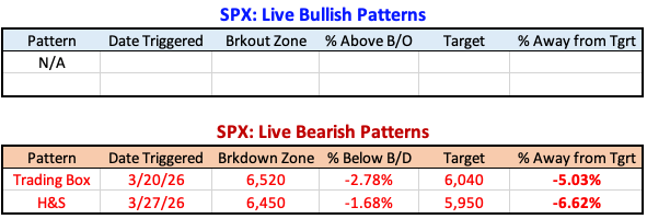
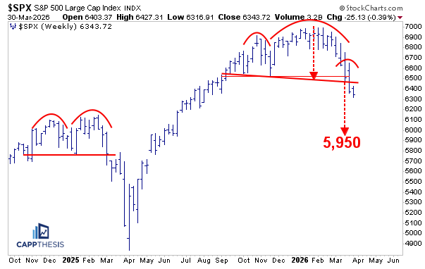
The SPX remains under the head & shoulders pattern’s breakdown point, as well. Downside target: 5,940.
GoNoGo – Remains in NoGo
The GoNoGo chart remains in NoGo mode.
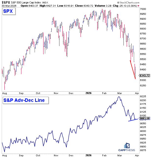
SPX vs. Adv-Dec Line
As noted above, the SPX has now recorded four positive breadth days in the last six trading sessions. This has occurred even as the index continues to make lower highs and lower lows, creating a minor, yet noticeable, positive divergence between the advance-decline line and price itself.
While price matters most, it’s something worth noting, especially given how sustained positive breadth helped keep the index buoyant from December through February.
That context is important because, during that stretch, large-cap tech was already underperforming, and it required broad participation from other sectors to maintain the uptrend. Once breadth began to deteriorate a few weeks ago—alongside the increase in closes below the intraday midpoint—the downside started to accelerate.
Now, while it’s still a short window of time, what we’re watching for is any change in character, with improving breadth becoming a key ingredient in supporting a potential bounce.
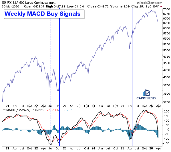
Weekly MACD Buy Signals
As the sell-off has intensified, we’ve discussed how the daily and weekly MACD sell signals have clearly proven effective. Looking at the weekly MACD indicator now, both of its lines are now approaching oversold territory – the zero line.
Once both the MACD line (faster line) and the signal line are firmly below zero, the setup would be in place for a potential weekly buy signal to trigger. Given how sharp the decline has been in recent weeks, it may not take much additional downside for that to occur.
This is important because, over the last few years, it has been relatively rare to see MACD undercut zero. The most recent instances were in April’25 (major trading low) and then October 2022. Four years ago, however, the FIRST buy signal in July’22 ended up being a sharp bear market rally that ultimately was faded. While this sample size is small, looking further back provides a useful reference point…
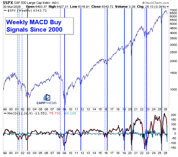
Weekly MACD Buy Signals since 2000
Here are all the MACD buy signals going back to 2000. The successful signals are marked by bold blue lines, while the unsuccessful ones are shown as thinner dotted lines. As we can see, most have worked—but not all the time.
There have been extended periods of stress over the last 25+ years, including the dot-com collapse, the Global Financial Crisis, and more prolonged volatility phases like 2015–2016. During those stretches, signals were less reliable in the moment. However, following each corrective phase—whether it lasted months or years—a successful MACD buy signal eventually emerged every time.
Thus, it’s an important indicator to track, but we’re not relying on MACD alone. If and when a buy signal does occur—on either the daily or weekly chart—it still needs to be confirmed by a bullish pattern beginning to form and gain traction.
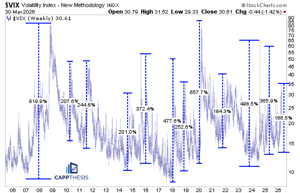
VIX – Moves of at least +100%
Despite the SPX rolling over and logging a negative reversal yesterday, the VIX did not move higher, instead falling 1.4% to start the day. This is another potential positive divergence to keep in mind, alongside the improving breadth discussed earlier.
Taking a broader view, we looked at the largest trough-to-peak VIX moves since 2007. There have been 12 instances where the VIX gained at least 100% from its intraday low to high. The current move—approximately +165% from the late December low to the recent high—now joins that group.
VIX – biggest trough-to-peak % moves since 2007:
At least +100%: 12
At least +200%: 9
At least +300%: 6
At least +400%: 4
At least +500%: 2
At least +600% 1
The two largest spikes, not surprisingly, occurred during 2007–2008 (8+20%) and the COVID crash (+660%).
This chart highlights a few key takeaways:
1. The current VIX move could still extend further from here.
2. A bear market does not require an extreme 500–600% surge. As seen in 2021–2022, when the VIX rose roughly +180% all in, which only is modestly more than the current move. Yet, the SPX continued to sell off for over 10 months before the low was etched.
This is why volatility should always be viewed alongside the frequency of absolute 1% SPX moves. We’ll dive deeper into that relationship in tomorrow’s April roadmap report.
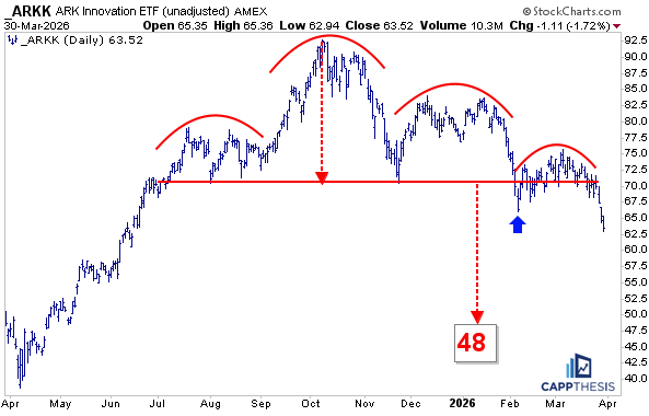
ARKK – The topping pattern
Growth was hit hard again on Monday, with the ARKK ETF falling 1.7%, pushing it further below its breakdown zone. As a result, the topping pattern remains intact, with a downside target of 48.
There are many charts that look similar, but given ARKK’s role as a proxy for speculative growth, it remains important to keep it front and center. A meaningful return of strong buying interest would not only be significant for ARKK itself, but also for its underlying components and the broader growth universe.
Conversely, seeing any bounce fail near the 70-breakdown zone once again would further frustrate dip-buyers and could lead to another leg lower.
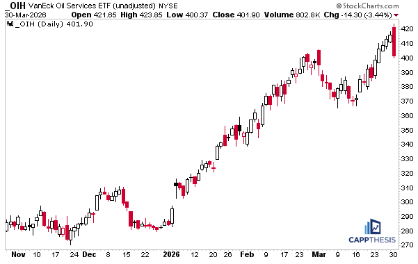
OIH – Bearish engulfing pattern
While growth underperformance was the headline after yesterday’s sell-off, there were also some significant reversals in energy ETFs. Most notably, the OIH Oil Services ETF registered a sharp bearish engulfing pattern, with the latest candle engulfing the prior three and pulling price back below its February high
Recall that OIH had recently completed another consolidation period and broken out to new highs. With OIH now marginally back below that former high point from early March, the focus now is how buyers respond to this reversal.
We’ve highlighted how energy ETFs had become increasingly parabolic, offering an unfavorable short-term risk/reward setup. This type of sharp reversal is exactly the risk in those conditions. From here, it’s all about follow-through.
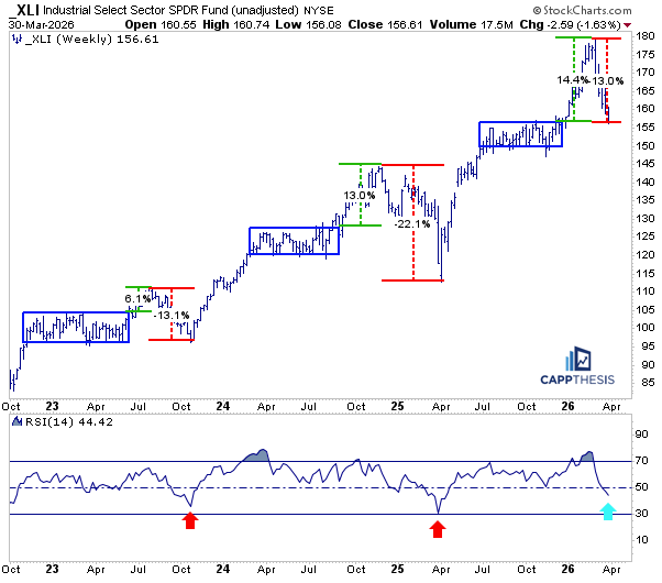
XLI – The pattern played out again
It may not have seemed likely at the time, but we noted that as XLI was breaking above its 2025 trading range, prior breakouts from similar ranges had ultimately been retraced.
We saw this play out in both 2023 and 2024–2025. In 2023, the pullback brought XLI back to the lower end of the prior range, while last year’s was even more severe: OIH undercut that range by a much wider margin amid the tariff tantrum-induced market crash.
Currently, XLI now has retraced the entire prior breakout move from late 2025-early 2026. And while the ETF hasn’t fully re-entered last year’s tight trading range yet, it wouldn’t take much additional downside for that to happen. Given how extended the move had been, a retracement like this isn’t surprising—especially considering the broader market pressure.
That said, this area could begin to attract buyers. If demand starts to build here and price stabilizes before fully breaking back into said range, it would be a constructive development. And that could set the stage for a more durable breakout attempt compared to prior failures.
B – Barrick Mining Corp.
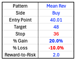
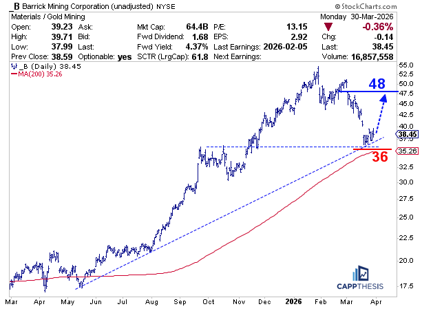
This is a big test for precious metals, as most are trying to recover from the sharp declines earlier this year and more recently. One of the more widely followed names, Barrick Gold (B), had fallen roughly 33% from its January high to the recent low.
What makes this setup interesting is that, on a log scale, the stock is attempting to hold a key uptrend line drawn from the May low of last year. The recent bounce occurred right near its prior breakout level, as well. Despite the pullback, it also remains above its rising 200-day moving average, which sits close to that same support area. Thus, we have a confluence of support to lean into now.
With that being the case, the stock is attempting to stabilize, which could give it a chance to retrace back toward the former breakdown area in the high 40s. We’re using 48 as a target, which is slightly above the 61.8% retracement of the decline.
Needless to say, precious metals have been pushed around by recent geopolitical headlines like many others. Thus, we’re keeping risk tight with a stop at 36 since, if this bounce fails, the pattern could quickly shift into a bearish flag.
CappNotes offers a small window into the work we do at CappThesis - a technical analysis newsletter company focused on classical chart patterns, trend, and risk management. Explore the full range of CappThesis services here:
Q2 please! Great read Frank
Really good breakdown. The point about positive breadth being worth watching, while still respecting the bigger bearish patterns, feels like the right balance here. Side note: My name is also Frank!