


Happy Tuesday. Below is an excerpt from today’s Opening Look note.
Also, check out my latest LinkedIn post here.
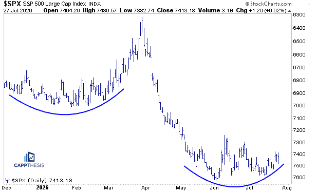
A Different Perspective: Turn the S&P 500 Upside Down
When a market is struggling to break out, I find it helpful to look at the chart from a completely different perspective.
Most of us naturally have a bullish bias—myself included. After a sustained uptrend, we tend to interpret consolidations as continuation patterns, expecting them to eventually resolve higher. And to be fair, they often do.
But not always.
One simple exercise is to flip the chart upside down.
Doing so removes some of that natural bullish bias and forces us to evaluate the price action more objectively. Sometimes, patterns that seem constructive in their normal orientation begin to resemble something very different.
An Interesting Comparison
Viewed upside down, the current S&P 500 pattern bears a striking resemblance to the market’s behavior from late 2025 into early 2026.
At that time, the index repeatedly tested the 7,000 area but failed to break through. Momentum gradually faded, market breadth had already begun to weaken, and once a negative catalyst emerged, the pullback accelerated.
Of course, we also know how that period ultimately ended—with a relatively brief decline followed by an exceptional reversal.
Today’s market is obviously not identical. But with the S&P 500 once again stalling beneath major resistance, this time near 7,600, it’s a scenario worth keeping in the back of our minds.
The GoNoGo Indicator Tells a Similar Story
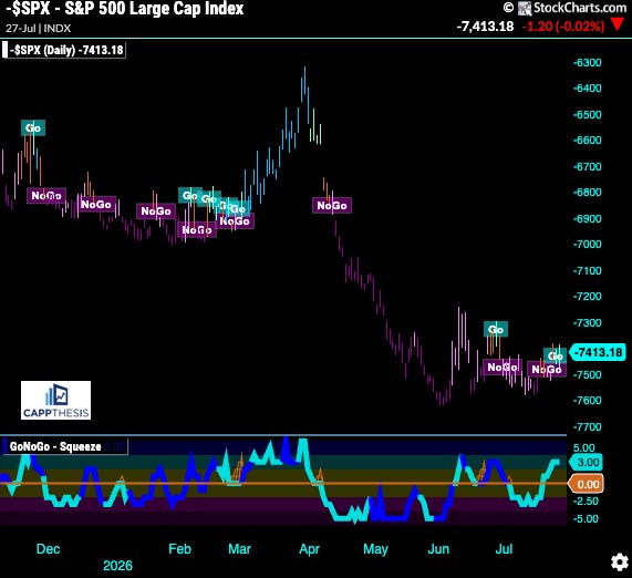
The same exercise becomes even more interesting when viewed through the GoNoGo indicator.
Flipped upside down, what would normally appear as a prolonged NoGo phase gradually transitioned into increasingly frequent Go signals before the eventual breakout. The improving trend signals complemented the developing bottom.
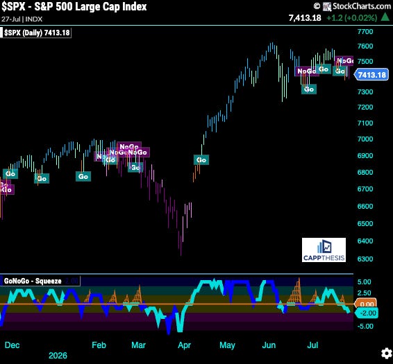
Returning the chart to its normal orientation suggests the opposite could now be unfolding.
The recent shifts in the GoNoGo signals may represent the early stages of a more meaningful deterioration—if the market begins to produce downside follow-through.
The Weekly MACD Sell Signal Has Triggered
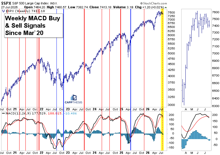
The potential weekly MACD sell signal we’ve been highlighting over the last two weeks has now been officially triggered.
As the chart shows, not every weekly MACD sell signal has led to meaningful downside. The thin red vertical lines identify the instances where the signal failed, with the S&P 500 simply continuing higher within its longer-term uptrend.
The thicker red lines, however, mark the occasions when the signal did identify an important top, leading to clear downside follow-through over the ensuing weeks or months. The late-2021 peak remains the most obvious example.
As always, the signal itself is only the starting point.
What matters now is the follow-through.
With earnings, the Fed decision, and several key economic reports all arriving over the next few days, we’re about to get a very good read on whether investors are willing to buy this latest dip—or whether sellers begin to gain more meaningful control.
The Bullish Case Remains Intact
Despite the recent hesitation, it’s important to remember that the bullish flag pattern remains intact, with an upside target near 7,680.
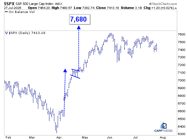
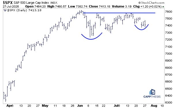
Likewise, the potential cup and handle pattern we’ve been tracking for nearly two months also remains viable.
The missing ingredient is the same for both patterns: follow-through.
We’ll need to see a decisive move above resistance before either bullish setup can be considered confirmed.
The Short-Term Bearish Pattern ALSO Is Still Alive
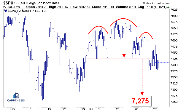
At the same time, yesterday’s negative reversal also kept the small bearish head-and-shoulders pattern alive for another session.
That leaves the market at an interesting crossroads.
The larger bullish continuation patterns remain intact, but the shorter-term bearish pattern has yet to fail. One of those scenarios will eventually give way.
The Key Takeaway
This isn’t a prediction that the market is about to break down.
Rather, it’s a reminder that perspective matters.
Whether it’s flipping the chart upside down, monitoring the newly triggered weekly MACD sell signal, or weighing competing bullish and bearish patterns, the goal is the same: remain objective.
The next several days could prove pivotal. Between earnings season, the Federal Reserve, and key economic data, the market is about to receive several potential catalysts.
Until price confirms one direction or the other, keeping both scenarios on the table remains the most disciplined approach.
CappNotes offers a small window into the work we do at CappThesis - a technical analysis newsletter company focused on classical chart patterns, trend, and risk management. Explore the full range of CappThesis services here: