


The following appeared in today’s pre-market Opening Look piece.
Opening Look is our flagship pre-market newsletter, in which we dissect the S&P 500, major indices, asset classes and ETFs. It’s delivered into four sections: Market, Statistics, Key ETFs and Chart Trades
Statistics – The first section analyzes daily market data such as new highs/lows, sector leaders & laggards, winning and losing streaks, how the market closes every day, S&P 500 vs. key moving averages and breadth. Seeing each one of these data points on the same table across multiple weeks reveals trends, sometimes before a shift is evident in the charts.
Market – The report’s second part is the meat of our market analysis. It includes studies, various S&P 500 charts, sentiment, breadth, indicators and a pattern tracker – a very helpful tool in determining our market stance.
Key ETFs – We showcase a handful of actionable charts from our 175 ETF universe in this section - potential breakouts/breakdowns, ETFs near important support/resistance zones and various other noteworthy set ups.
Chart Trades - Here we provide trade ideas based on individual stock charts. We categorize each idea so clients can easily understand the strategy. We also relay specific entry and exit levels, which presents a clear framework.
This an excerpt from the Market section:
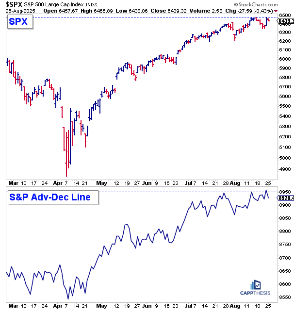
SPX Breadth
As we know, breadth has been scattered recently. Over the last 20 trading sessions (since July 29), the S&P 500 has seen 11 negative breadth days and 9 positive.
Not surprisingly, the index hasn’t moved much at all — it’s only up about 1% from the close on July 29. The market has seen head-fakes in both directions, with neither side able to control momentum.
This is much different from what we saw from mid-April through early summer. Back then, of course, the S&P repeatedly found dip buyers, carrying it to new highs through mid-August. But since then, with no true upside follow-through, the market’s character has become a tad less trustworthy compared to the prior few months.
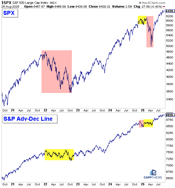
There haven’t been many breadth divergences, as the S&P 500 advance–decline line has more or less tracked the index itself. This isn’t surprising — we rarely see distinct, long-lasting divergences between the S&P and its A/D line…
When they do occur, however, they can persist for quite a while. A good example was 2022, when the A/D line oscillated near its highs for most of the year even as the index dropped more than 20% from peak to trough.
Notably, at the end of the summer bear market rally in 2022, the A/D line actually made a new high — a false signal, as the index rolled over soon afterOne time when the advance–decline (A/D) line did flash real weakness was at the very end of 2024. The S&P 500 logged 14 consecutive negative breadth sessions to start December, which ultimately set the stage for the market rolling over.
On the flip-side, as the tariff-induced crash unfolded, the A/D line essentially flatlined. If nothing else, this signaled that the largest names were getting hit the hardest, exerting an outsized influence on the index’s direction.
Ultimately, the A/D line does provide important clues about what’s happening beneath the surface. When most of the field is struggling, the index can still advance for a while — but eventually, the biggest names tend to “catch down”.
That dynamic will be critical to watch going forward, which brings us to the NASDAQ and its own A/D line…
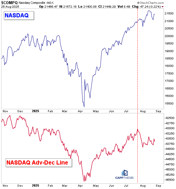
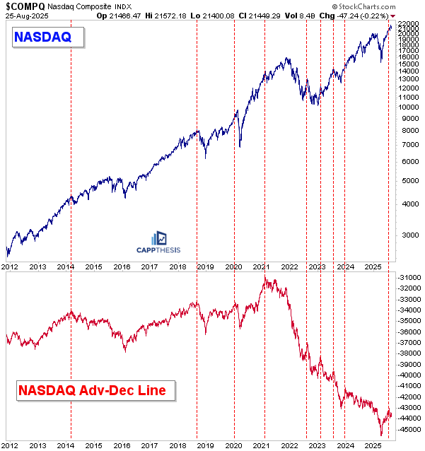
NASDAQ Adv-Dec Line
As most people realize by now, the NASDAQ advance–decline line has been in a perennial downtrend since the index’s inception more than 50 years ago. Still, there have been periods when it moved higher — typically when everything rallies together, especially the more speculative names.
That’s been the case recently. However, the NASDAQ A/D line peaked at the end of July, and since then we’ve seen under-the-surface weakness as more names in that space have started to pull back, even while the index itself has continued higher.
If we zoom out to 2020, the NASDAQ advance–decline line has been trending lower the entire time, even as the NASDAQ index itself has moved higher… However, it’s very important to watch for this reason.
Each time the A/D line peaked (as shown by the red lines), it often led to pauses in the NASDAQ — and at times to larger pullbacks. We saw this in the summer of 2022 and again in the summer of 2023, which produced about three months of declining action.
So far, the latest peak has only resulted in a slight pause. But if the A/D line continues to move lower, it could signal even more digestive action ahead for the NASDAQ.
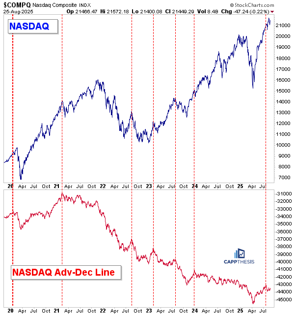
Looking longer-term, the last two major peaks in the NASDAQ A/D line came in late 2018 and early 2014 — both of which were followed by periods of heightened volatility in the index itself.
NQ A/D line is most useless indicator.. for any indicator to be useful. It need to have decent predictive power. It doesn’t meet even meet min of criteria