


Key Points
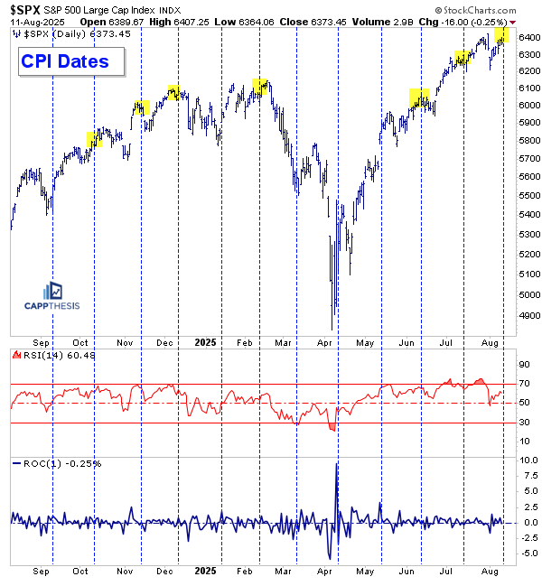
The S&P 500 logged another small loss to start the week on Monday, dropping 30 basis points. Going back to Monday, July 7, nine of the last ten losses have been less than 50 basis points. The lone exception came on August 1, when the index dropped 1.6% — but there’s been no downside follow-through since.
Over the last six sessions, the S&P has alternated between gains and losses, with both bulls and bears looking for a reason to see some follow-through. With CPI released this morning, this could be a clear catalyst for either side.
Today, we’re looking at the last few times the index has been at or near an all-time high on a CPI release date. We’ll also take a deep dive into the 10-year yield across various time frames, plus a brand new chart idea.
SPX & CPI
The S&P 500 comes into today very close to its most recent all-time high from late July, as shown in the chart covering the past 12 months. This is now the seventh time the index has been either at or extremely close to its highs heading into CPI Day.
In each of the prior six instances, near-term price action after CPI Day showed either sideways movement or weakness. In other words, buying immediately before or right after the CPI release hasn’t historically produced immediate upside.
That said, most of the time the index regained its bid relatively soon after the announcement. With the market still up more than 30% from recent lows, buyers have displayed so far in August. We’re still watching for the completion of the next bullish and/or bearish setup, both of which continue to take shape. If today’s early strength is leveraged throughout the session, the next bullish pattern could be completed. See more below.
GoNoGo Trend – Daily
A few days ago, a green dot appeared on the daily GoNoGo chart…
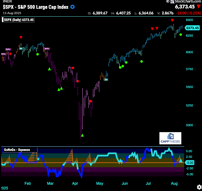
Green dots are Go Trend Continuation Icons, which means:
The asset is already in a strong “Go” trend (bullish, shown by bright blue bars).
The GoNoGo Oscillator has retested the horizontal zero line (on the bottom panel) from above and bounced back upward.
This is a signal that the bullish trend is resuming after a pause or pullback, and it can be a potential entry or add-on point for trend-followers.
As is clear, this already happened four prior times during the comeback, with all leading to upside follow through. There’s no guarantee that this will happen again now and seeing just how well this dip is bought will tell us a lot about the market’s character.
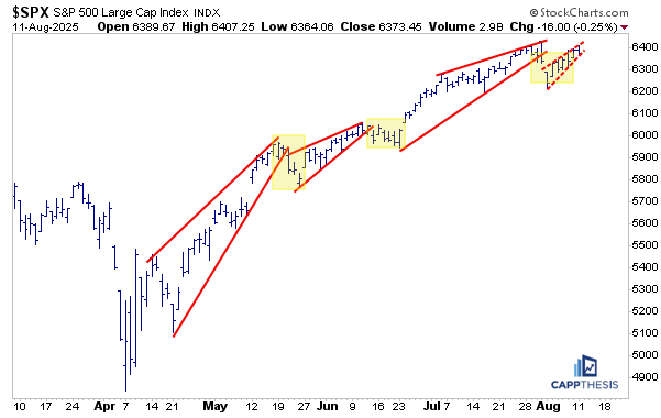
Potential Patterns
Here are the updated potential bullish and bearish patterns. Remember, the same exact chart is being used for both variations. As noted above, we could see a breakout attempt today.
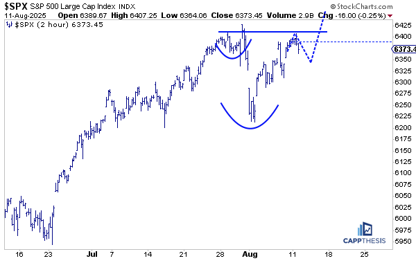
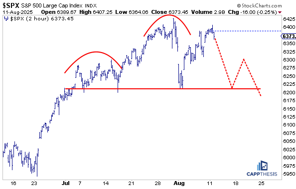
With the slight comeback over the last week and a half, we can see that a fourth potential rising bear wedge pattern is now under construction. We’ve been profiling these since May, noting that the last three breakdown attempts were all short-lived, which then set the stage for the market to continue rallying and for new patterns to form.
As stated before, this has clearly been bull market action — even the steepest uptrend lines, once broken, have yet to give way to any real downside follow-through.
10-Year Yield – Daily
As we know, the 10-year yield has been bouncing over the last few days…
Pivots cleanly defined..6200 and 5900