


TGIF - In today’s Opening Look, we took a deep dive into both Micro and Small Caps across various charts. We’re sharing a few of them from that discussion this morning.
Also, check out this piece I did for stockcharts.com, published last evening:
What Staples, Silver, and Semis Are Telling Us Now
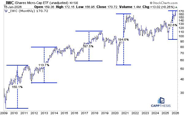
IWC – The biggest trough to peak rallies since 2009
From the April’25 lows, the IWC Micro-cap ETF is now up 82%, which is a substantial run, particularly given that it has occurred over a nine-month period. That naturally raises the question: is this as good as it gets, and are we nearing a top?
When compared to the largest trough-to-peak advances going back to the Financial Crisis, if IWC’s rally were to end now, it would actually be the smallest of them all over the past 16+ years. In fact, three of the four prior rallies gained at least 113%, with the post-COVID advance into the early-2021 high at nearly 200%. This history provides a useful blueprint to keep in mind.
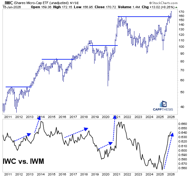
IWC vs. IWM- Relative strength
Again, we know that the Russell 2000 ETF (IWM) has been doing well, but this micro-caps run has created extreme and obvious outperformance, as indicated by the very steep relative-strength line in the second panel of the chart.
We’ve seen this setup before: when IWC begins to rally and breaks out of multi-year bullish patterns, those breakouts have tended to extend, and during those extensions, relative performance versus IWM also improved. From this perspective, it suggests the breakout has legs, on both an absolute basis and on a relative basis versus IWM.
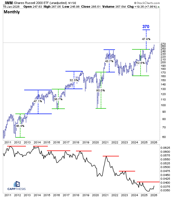
IWM – Long-term follow through moves
Much like IWC, the Russell 2000 ETF (IWM) has shown the ability to not only break out to new all-time highs, but to extend meaningfully higher afterward. Shown here in green are the moves from key low points to prior highs, and then in blue, the advances from the breakout zones until IWM topped — each of them extremely strong.
As we’ve shown before, if IWM were to come close to matching its move from the 2023 low to the 2024 high following a breakout, it would target roughly 370, which is still considerably higher.
The obvious question, of course, is whether we could expect anything more at that point on a relative basis. As is clear, the IWM versus the S&P 500 relative-strength line has continued to make lower highs for years, as shown on the chart below. So, is this time any different?
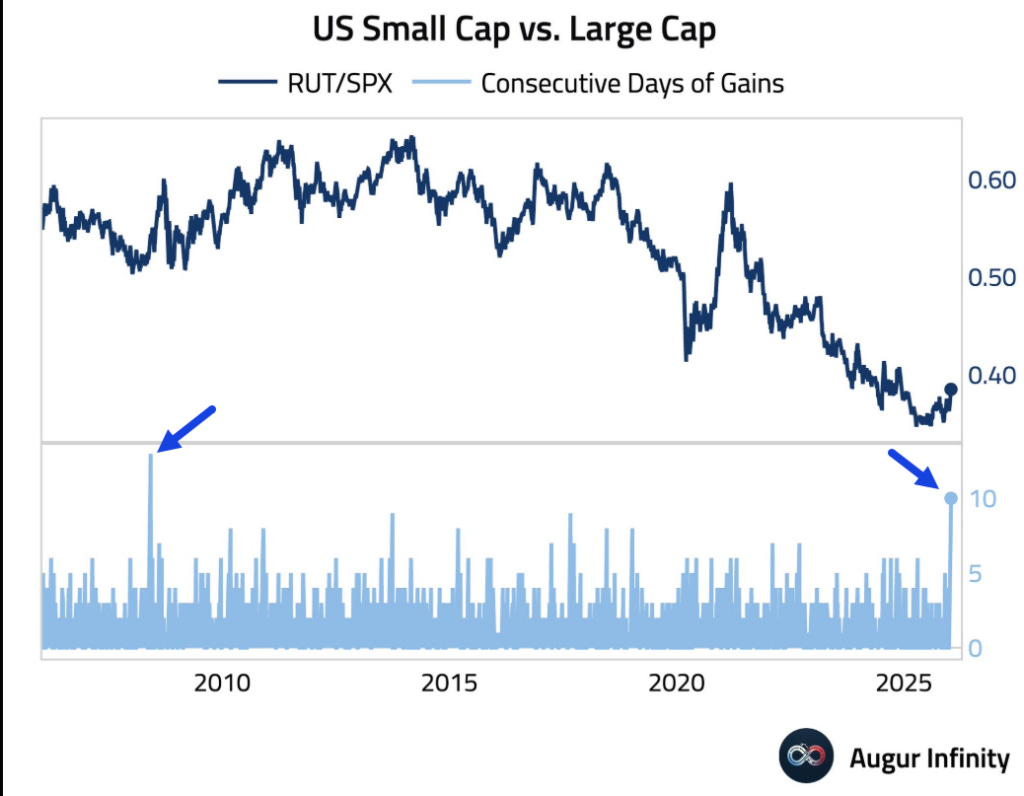
IWM > SPX for 10 straight days
Well, the Russell 2000 has now outperformed the S&P 500 for 10 straight days. This chart, shared by Augur Infinity, shows that this is the longest streak of outperformance since 2008. That period was still in the middle of the Financial Crisis, yet it soon marked the start of a multi-year stretch of outperformance for small caps versus the S&P 500.
In that sense, this setup is different from anything we’ve seen over the past 15 years, at least when viewed through the lens of a 10-day relative-performance streak.
MicroCaps’ best performing stocks
Not many people closely track micro-caps, and even fewer know what actually makes up the IWC ETF. However, that’s the most important part. The explosive moves from this collection of stocks are…
CappNotes offers a small window into the work we do at CappThesis - a technical analysis newsletter company focused on classical chart patterns, trend, and risk management. Explore the full range of CappThesis services here: