


Happy Tuesday - This is an excerpt from the Market Section of today’s Opening Look.
For new subscribers, Opening Look is a daily pre-market note, in which we dissect the S&P 500, major indices, asset classes, ETFs and individual stocks. It’s categorized into four sections: Market, Statistics, Key ETFs and Chart Trades
Statistics – The first section analyzes daily market data such as new highs/lows, sector leaders & laggards, winning and losing streaks, how the market closes every day, S&P 500 vs. key moving averages and breadth. Seeing each one of these data points on the same table across multiple weeks reveals trends, sometimes before a shift is evident in the charts.
Market – The report’s second part is the meat of our market analysis. It includes studies, various S&P 500 charts, sentiment, breadth, indicators and a pattern tracker – a very helpful tool in determining our market stance.
Key ETFs – We showcase a handful of actionable charts from our 175 ETF universe in this section - potential breakouts/breakdowns, ETFs near important support/resistance zones and various other noteworthy set ups.
Chart Trades - Here we provide trade ideas based on individual stock charts. We categorize each idea so clients can easily understand the strategy. We also relay specific entry and exit levels, which presents a clear framework.
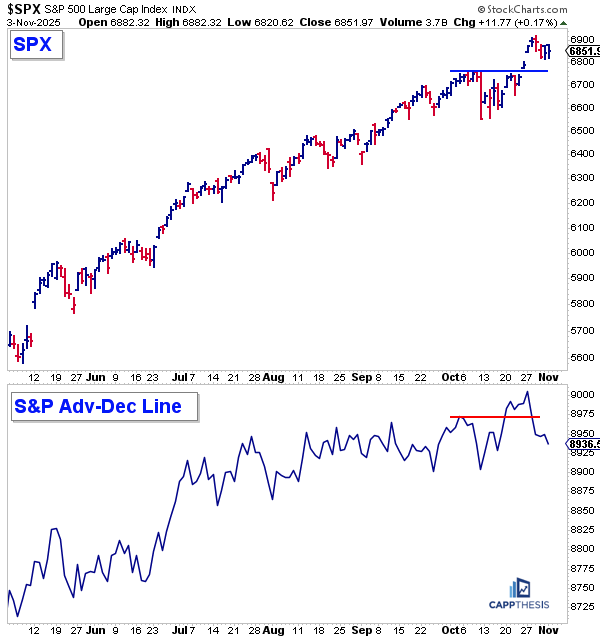
The Cluster of Bad Breadth
We recently discussed the S&P 500 cumulative advance-decline line, noting that it — along with the S&P 500 index itself — had been making new all-time highs, confirming the broader move.
However, things began to shift last week, starting on Tuesday, right after the index’s last 1% gain. Even though the S&P 500 has held near its highs and remains above the breakout zone near 6,750, the advance-decline line has been hit harder. It’s now back below its recent peak and also under the early October high, creating a negative divergence worth noting.
We’ve seen this oscillation before — especially since late May — with larger declines along the way pushing the advance-decline line around more violently than the index itself.
As we know, the S&P 500 still hasn’t fallen more than 3.5% from a high, but if breadth continues to deteriorate, then the foundation obviously will also weaken.
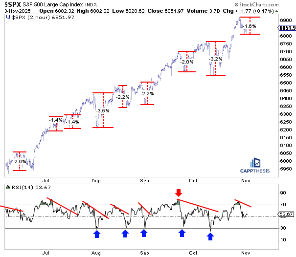
Short-term Pullbacks
As of last night’s close, the S&P 500 had remained above its low from last Friday, with the peak-to-trough decline amounting to only about 1.6%. On the two-hour chart, this is clear — if the pullback had stopped there, it would rank among the smallest drawdowns of the past few months.
So far, the sell-off hasn’t been deep enough to push the 14-period RSI back into oversold territory. As of last night, the RSI still hovered near 50.
Each of the prior drawdowns since August, though, was strong enough to bring the indicator down to the 30-zone. The good news, of course, is that this attracted dip buyers each time (see blue arrows).
Based on the pre-market action today, that kind of deeper pullback may need to occur again before the next round of demand emerges.
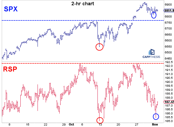
SPX & RSP
Things have started to look very different beneath the surface over the past two weeks. Even though both RSP (the equal-weighted S&P 500) and the S&P 500 rallied following the 2.7% decline on October 13, RSP failed to make a new high early last week — while the S&P 500 gapped above its prior high and continued to push through 6,900.
It’s clear that the subsequent pullback in RSP has been just as severe as the mid-October decline. As of last night, RSP is nearing that prior low, while the S&P 500 continues to hover above its 6,750-breakout zone.
The risk is clear: if the big-cap names begin to catch down, it could have a significant impact on the S&P 500, as well.
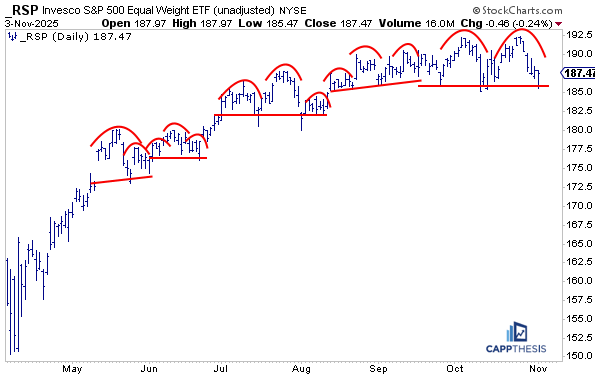
RSP Equal Weight S&P 500
We’ve seen plenty of failed bear patterns in the S&P 500 over the past few months — and the same goes for the RSP. While it hasn’t benefited from mega-cap strength, most of its constituents have still participated enough to keep the topping formations from playing out… yet.
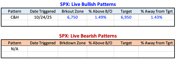
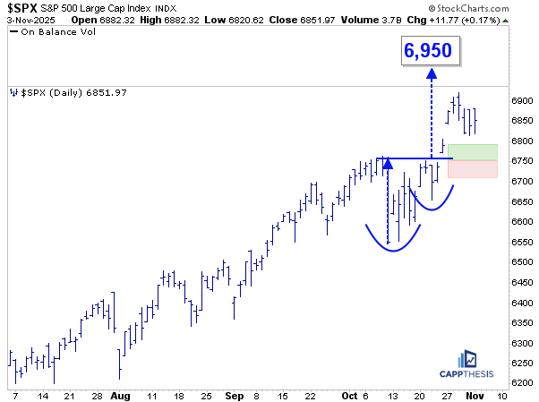
Patterns
The S&P 500 starts today about 1.5% above its key breakout area near 6,750. As we’ve seen over the past several months, most of the bullish patterns have been leveraged and have consistently met their measured targets — a pattern of follow-through that’s helped sustain the ongoing uptrend.
When bullish patterns begin to fail repeatedly, that’s a clear sign the trend is being challenged. The next step after that would be to start seeing bearish setups begin to form. That’s a few steps ahead, but something we’ll be tracking closely.
RSP chart looks
Really ominous
If it breaks down
Look out Below
Have been in 80% cash for a week