


Key Points
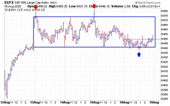
The S&P 500 dipped slightly to start the week yesterday, barely losing one basis point. This kept it within the same tight trading range it has been in since last Wednesday, August 13.
Today, we’re taking a close look at the last eight weeks of trading, diving deep into the daily price action to gain a better understanding of the current trading environment, reviewing various key ETFs and discussing a new trade idea.
Last Five Trading Days
Daily Price Action
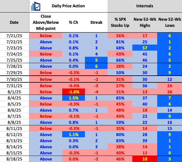
It was officially the S&P 500’s second straight decline, though both losses were less than 30 basis points. We also saw negative breadth for the third consecutive day, but at only 46%, it was barely notable.
Of interest, only 10 S&P 500 stocks made new 52-week highs, the fewest since June 13 (when there were also 10) and before that, May 29 (when there were just 9). This is one metric that needs to improve going forward.
On the positive side, the index did close above its midpoint for the fifth straight session.
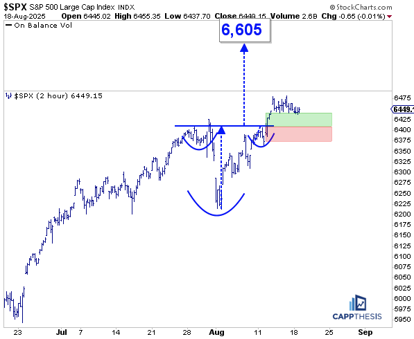
Last Eight Weeks
After the close yesterday, I posted this stat on X:
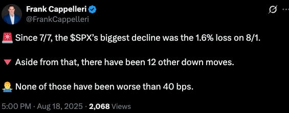
It didn’t get much engagement—only the simplest charts tend to spark reactions—but it was a telling stat nonetheless.
Looking more closely at the daily stats table along with the SPX bar chart (below), it’s clear that this ultra-calm environment—with hardly any meaningful down moves—has been in place for some time.
Here’s how it breaks down – Since 6/13/25:
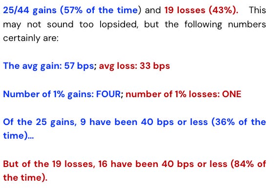
And that tells the full story, which is clearly depicted on this chart:
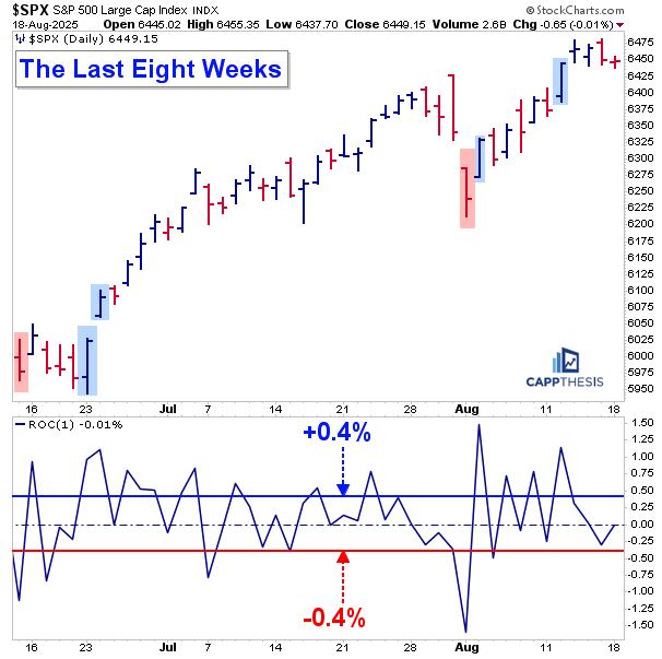
Indeed, this isn’t a major revelation. But it’s important to recognize nonetheless.
Why? Because the tiny downturns have been the only thing sellers have managed to produce—and on the few occasions when a bigger decline did emerge, it turned into a buying opportunity that traders quickly snapped up. Each time, they’ve been rewarded.
We can debate endlessly about why this “shouldn’t” be happening—whether the rally is top-heavy in the biggest names, or whether it’s being driven by the most speculative, retail-driven stocks.
But ask yourself: when was the last time both the “biggest and best” and the “tiniest and worst” stocks were blamed simultaneously for fueling a market-wide advance? The market has gone from climbing a wall of worry to scaling a wall of hate.
Regardless, this environment continues to support buying. More importantly, it has allowed bullish patterns to keep forming and working, as we’ve highlighted in the Pattern Grid and live setups. Low volatility not only helps bullish patterns develop, but it also prevents bearish patterns from completing.
Of course, we know this can’t last forever—but for now, it continues to work.
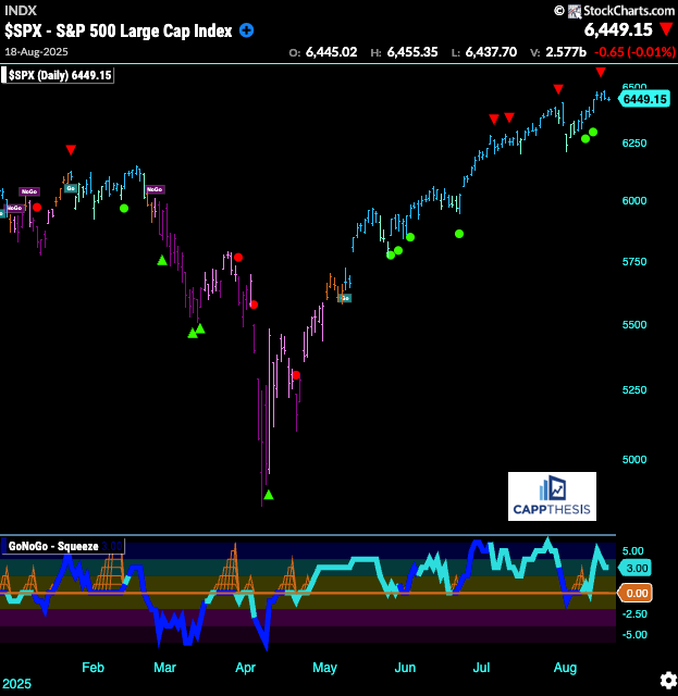
GoNoGo Trend – Daily
Repeating from yesterday, so far, the counter-trend signals that have appeared on the GoNoGo chart have also led to buy-the-dip behavior. With the latest one happening last Thursday, this will be another test for the bulls.
As we’ve reviewed in the past, this very same dynamic was prevalent throughout much of the rally from late 2023 through March 2024, as the market extended higher in a very consistent and orderly fashion—much like what we’ve been seeing again over the last several months.
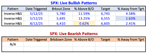
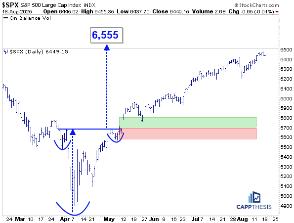
Live Patterns
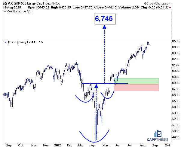
Our three live bullish patterns remain – targets of 6,555, 6,605 and 6,745.
Potential Patterns
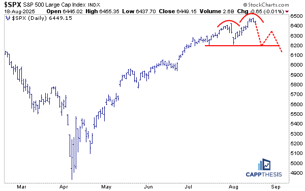
If the S&P were to roll over from its most recent high, a bearish setup like this could re-emerge.
As we know, a key trait of an uptrend is failed bearish patterns. This has been on display for the past several months, and history offers plenty of examples showing how powerful this concept truly is.
We will therefore continue to track each bar pattern along the way, knowing that if these setups fail, it only reinforces the strength of dip-buying by investors.
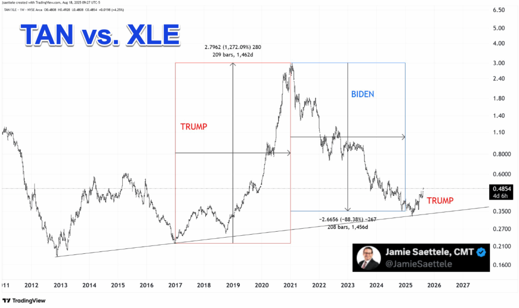
TAN Solar
The TAN ETF extended its impressive comeback yesterday, gaining over 4.5%. Importantly, it is now trading above a cluster of weekly moving averages—levels that the stock had repeatedly faded at over the last few years. This is clearly marked by the plethora of red arrows on the chart.
On the bottom panel, the 14-week RSI has reached its highest point since mid-2022. As we know, it didn’t get much higher than this before the bear market in TAN (and the broader market) resumed. From this perspective, the next step to watch would be if the weekly RSI pushes back into overbought territory.
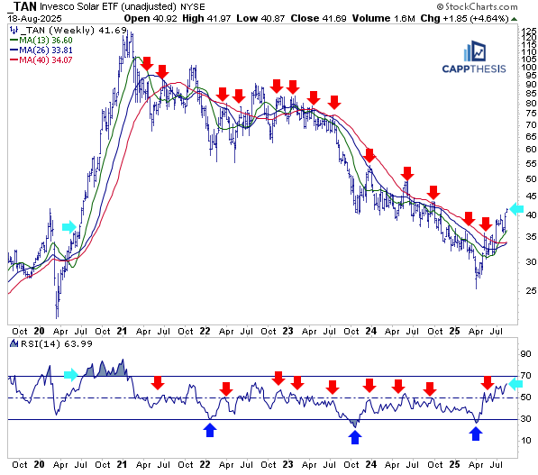
The last time that happened was during the extremely strong rally following the COVID pivot low, when extreme overbought conditions persisted through much of that powerful year-long move from 2020 into early 2021. Even with the recent strength, TAN remains well below prior levels and still has a lot of ground to make up.
So the question is: can we expect more from TAN from this perspective?
James Saettele shared a really interesting chart yesterday on X, comparing TAN to the XLE (Energy ETF) on a relative basis. The chart showed that TAN strongly outperformed XLE through most of President Trump’s first administration (2017–2020).
Coincidence or not, when his term ended, the ratio collapsed. Now, however, it has begun turning higher again as Trump’s second term gets underway. There’s still a long way to go before this move could replicate the earlier outperformance, but the similarities so far are undeniable.
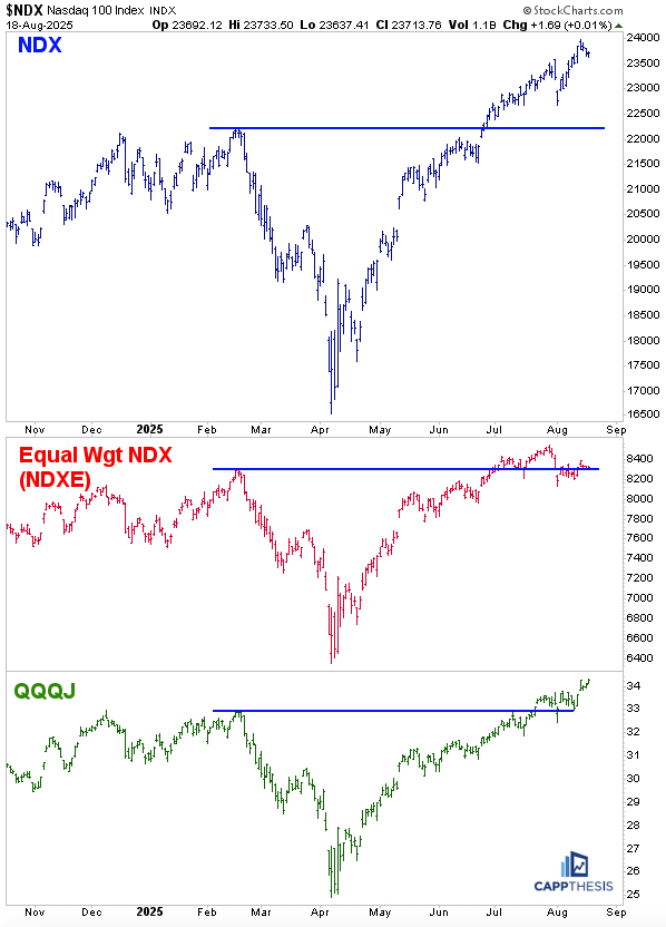
NDX, NDXE, QQQJ
You may have missed it, but the QQQJ (NASDAQ Next Generation 100 ETF)—which tracks the next 100 largest NASDAQ stocks after the NDX—made a new 52-week high, even as the NDX itself continued to marginally pull back.
It’s not as if QQQJ has been sitting out this rally: it’s up about 38% off its April lows and is now setting new highs. In fact, it has done even better in recent weeks versus the NDX Equal Weight Index (shown below in red).
Overall, the comeback in growth has been strong across the top 200 NASDAQ stocks. Sometimes rotation plays out not just between sectors and factors, but also within them—as we’ve seen recently inside the growth space.
That creates a much stronger foundation than a market led only by the biggest names. Regardless of what some may say, this rally has not been narrow—breadth remains strong across the board.
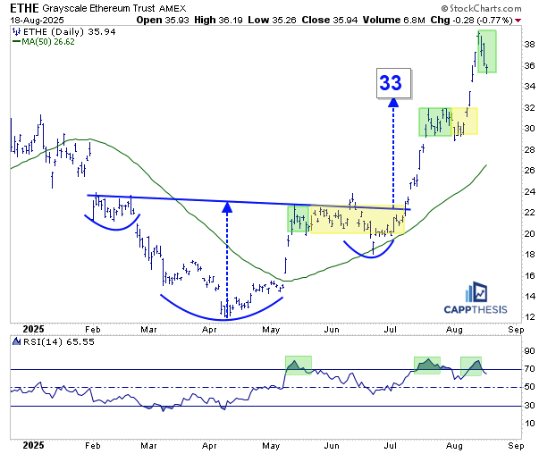
ETHE Ethereum
As Ethereum has continued to pull back, so too has the ETHE ETF. This comes as no surprise at this stage. As we’ve noted in recent weeks, this is now the third time ETHE’s 14-day RSI has reached 80.
The last two instances are pictured here:
1-From May to July, when the initial pause lasted several weeks.
2-From July to August, when a similar cooling-off occurred.
We should give this pullback time to neutralize the extreme overbought condition once more. Looking at the bigger picture, Ethereum may be breaking out from a multi-year pattern with very high implications. That means we can afford to be patient in the short term with ETHE.
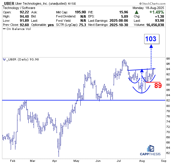
UBER
UBER had a strong day yesterday, and with the comeback, it’s clear that the stock has negated its second potential bearish pattern since May.
At the time, we highlighted the first setup: if a high-profile growth name like Uber had rolled over and broken below support near 82.5, it could have influenced other stocks to follow. Instead, Uber held that level twice and pushed to new highs.
Now, with the second bearish pattern, there was a marginal downside break, but that too ended up being just another dip-buying opportunity…
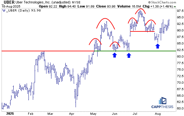
The resulting pattern now resembles a potential bullish inverse head-and-shoulders formation. A breakout through the 94 level would project a modest target of 103—a level well above the prior high.
Such a move could then trigger additional momentum buying, reinforcing the bullish setup.
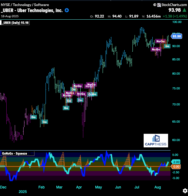
From the GoNoGo chart, it’s clear that Uber has once again flipped to bullish after several weeks of back-and-forth movement.
The last two times this occurred—in April and then again in early 2025—it was followed by a strong upside move over the subsequent weeks.
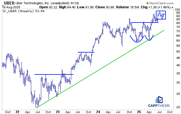
Zooming out to the weekly chart, it’s clear that Uber remains in a long-term uptrend. The most recent formation can be classified as a high-level consolidation pattern, developing above the much larger breakout from earlier this year.
Wow! So much territory covered in the post.. I am big Range Breakout investor/trader.. I couldn’t help noticing beautiful 2hr chart of spx